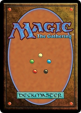
For a card game one of the most memorable pieces for me is the card's back, especially in games like Magic, Pokemon, and Yu Gi Oh. Heck, I even remember some of the cool designs on regular old playing cards because they're so symbolic to the card game. My point is, for a card game where players often see the back at least, the back is an important feature to consider when designing the look.
It just so happens that Masquerade is one of those games where player's often see the backs of the cards.
I spoke of the back being a symbol to the game, and it really is on some levels. The back is going to appear on every card in the game, so it's important to give the players a message to take away from looking at it if that's your intention. Taking a look at Magic's card can speak volumes about the actual game itself. It appears to be some sort of cover to a book, much like one of the old tomes wizard use in fantasy stories. In the center of the card are five circles, each a different color. These aren't like the four red circles in the corners of the cards, which are probably a part of the book cover. The designer wanted us to see these five colors (red, blue, green, white, black) for a reason, so they must mean something. Lastly is the text with the name of the game, Magic the Gathering, at the top and the words Deckmaster at the bottom.
What can we take away from this card back? Well besides the name, we can deduce that the game probably involves wizards on some level due to the tome-like design and the words Deckmaster. We also must guess that those five colored circles in the center play some significance in the gameplay.
Those who actually have played Magic will know that this is correct; the game is about two wizards fighting each other with summoned creatures of five different elements. That's saying a lot about the context for such a small picture which is also uniform enough to allow for a deck of sixty or more of these cards to not look unusual. If you're wondering what I mean by uniform design, take a look at the back of a playing card sometime. While the art is very beautiful, it's not so distracting that you lose sight of the more important part of the card, the actual front with the information!
So if there's two things to take away from the card backs it's this: they must show a little about the context of the game and they must be uniform on some level. For fun, let's take a look at some of the designs Masquerade has gone through over the months.
The first design was certainly uniform enough to suit a card back and correctly conveyed the context of conflict as well as the medieval setting, but it didn't quite hit the point I wanted to send to the players. You see, when the players have their cards face down, it means they're "hidden". Mystery was an important theme of the game that this back doesn't display. Though it certainly is a nice design that I wouldn't mind going with.
The next design a friend made for me was certainly more mysterious and dark, but it wasn't quite what I was looking for. The images felt too strong and distracting and the strong color draws your eyes to the card. I imagined players would share more at the back than the actual card!
Don't think that means I don't like the other designs! They're both really awesome, they just don't quite fit with the style I wanted to pursue. As I said, they certainly gave me ideas!


.jpg)


No comments:
Post a Comment